A streamlined experience for making medical appointments
Project type
Google UX Design Professional Certificate project
My role
UX Designer
Tools
Figma
MIRO
Balsamiq
Midjourney
Responsibilities
User interviews
User journey mapping
Ideation
Paper prototype
Digital wireframing
Building design system
Conducting usability studies
High-Fidelity prototype
Interaction design
Duration
6 months
OVERVIEW
Background
"Digital health is not a silver bullet, but it's a golden opportunity to advance healthcare, making it more data-driven, patient-centered, and accessible for everyone."
--Eric Topol, Digital Health Expert

More and more people require some kind of medical care. For many of these people, especially the elderly, it's an enormous challenge to organize and attend medical appointments, not to mention the frustration and health implications of long waiting times. I recognize this challenge around me, including in those close to me in my own family.

As a student of the Google UX Design Professional course, I had the opportunity to select a topic for a UX design project. Given the above, I decided to focus my efforts on the this problem. The goal is to design an app that will facilitate access to medical care by streamlining the process of making and managing appointments.

The design is for a fictitious hospital named "Zenith". As a name for the app I picked "Pulse" for its simplicity and the association with vitality and health.
The goal is to design an app that will facilitate access to medical care by streamlining the process of making and managing appointments.
Product preview
RESEARCH
Research
  • User research
  • Problems Statements and Personas
  • User journey map
User research
I conducted 6 interviews. All participants mentioned the inconvenience of having to use the telephone for making an appointment. As expected, people also mentioned the general lack of doctor availability and long waiting times.

However, I also learned about new, unexpected needs: One example is that some people try to get an appointment by calling multiple hospitals in their region, as this increases their changes of successfully finding a slot. This clarified that the app should make it easy to search for availability accross all Zenith hospitals.

Another unexpected insight I gained is that some people are looking for daily health news. As an example, various participants mentioned that they would love to have had access to news updates on the Covid situation. I will consider providing this type of medical news on the home screen of the app.
1
Pain point
90% of participants express that they find it inconvenient (a "hassle") to have to make appointments via telephone
2
Pain point
60% experience long waiting times or cannot make an appointment at all due to lack of availability
3
Pain point
30% mention they sometimes have to contact various hospitals to find availability
Personas
In this section, I introduce the User Personas I've created based of the interviews. The interviews I conducted seem to drive towards two distinct user personas, each with their own specific pain points and needs. In particular they personify different levels of digital skills and age brackets.

Note that the (empty) templates I used as a starting point were provided by the Google UX Design Professional course material. I generated sample persona images using Midjourney.
Jack Abels
Problem statement: Jack would like to make medical appointments as quickly and easily as possible, because his family's health is a priority and he has a very busy life as a working father.
Guido de Vries
Problem statement: Guido would like the process of making a medical appointment to be as simple as possible, because he is not too experienced with using digital products. He would also like to have easier access to medical information so he doesn't have to make an appointment for every small thing.
User journey map
As part of the Google UX Design training I was asked to work out one user journey map for a single persona. I chose "Jack Abels" to help identify opportunities where the app could add value. As mentioned in the Persona section, Jack's objective is to be able to make and manage medical appointments as quickly and easily as possible.
STARTING THE DESIGN
Starting the design
  • Paper wireframes
  • Digital wireframes and Low-Fidelity prototype
  • Usability study
Paper wireframes
As part of the Google UX Design Professional course, I was asked to create paper wireframes only for the first few screens of the application. For the Paper wireframes, I chose to use Balsamiq for its efficiency while still having a high level of flexibility, like traditional paper.
Digital wireframes and Low-Fidelity prototype
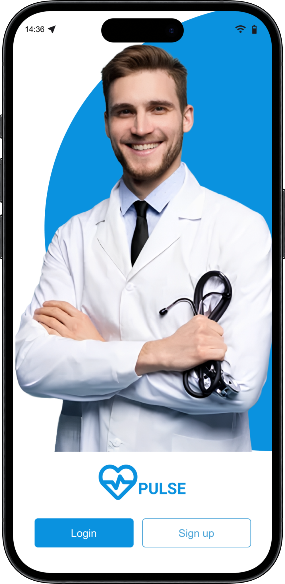
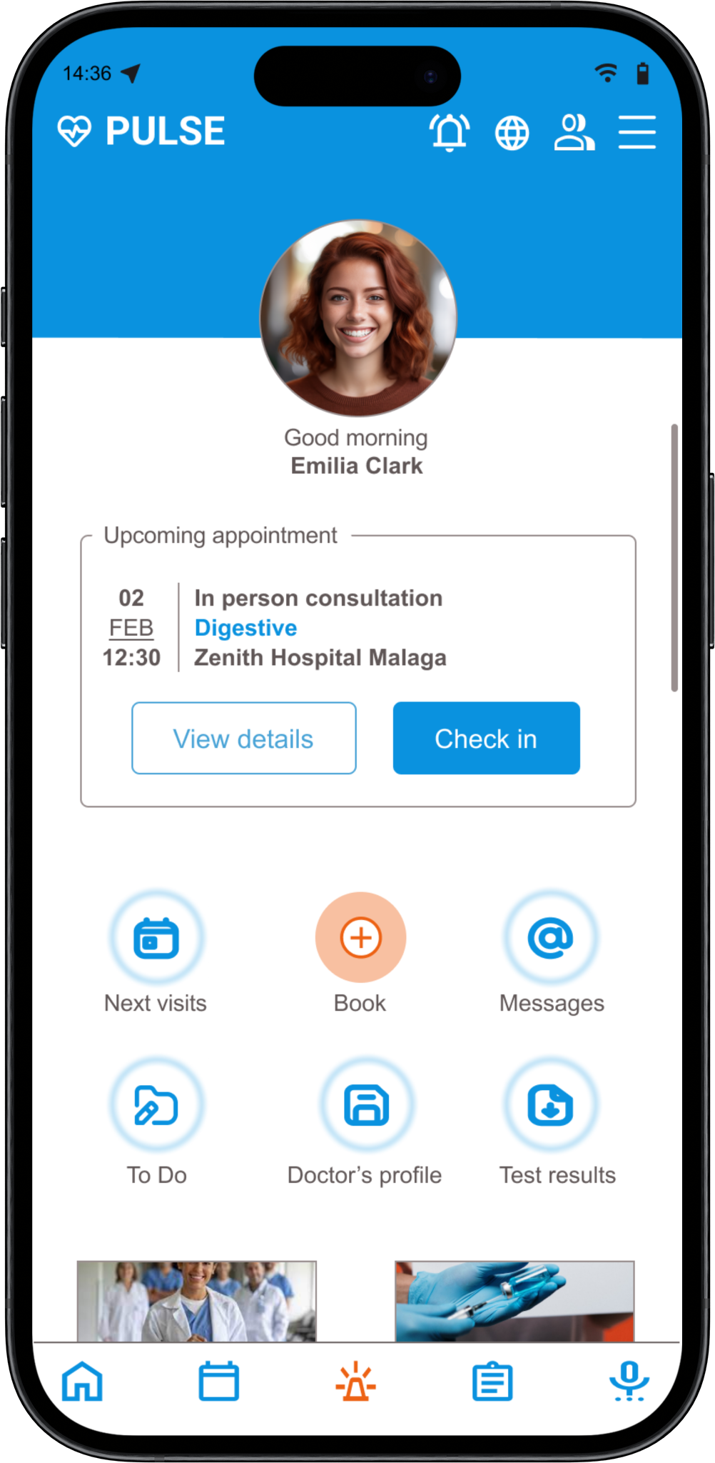
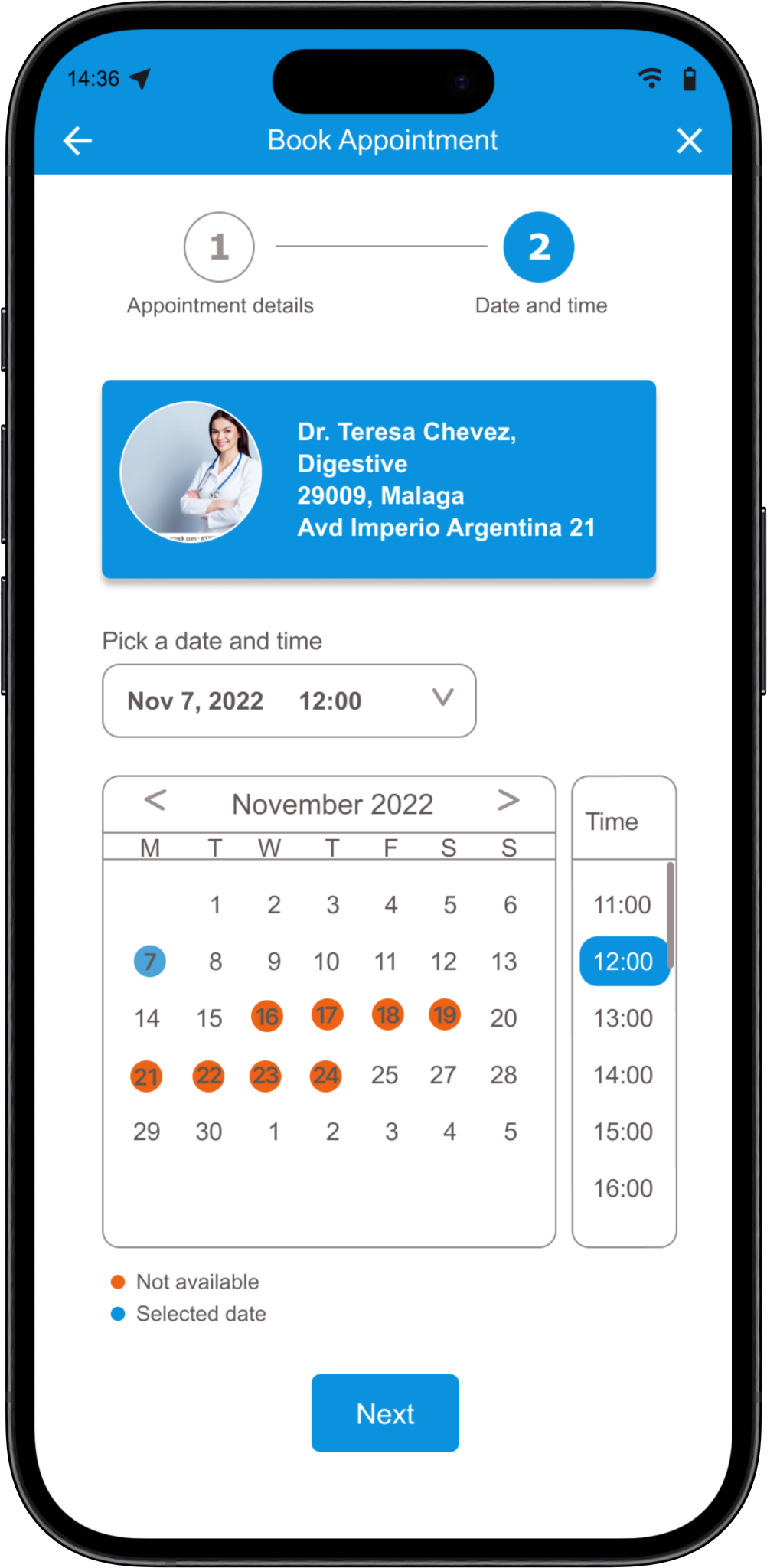
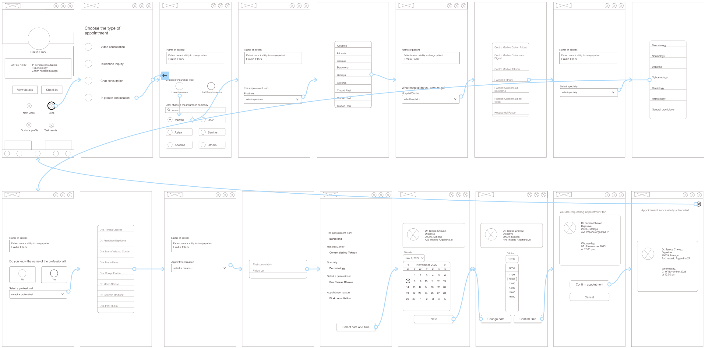
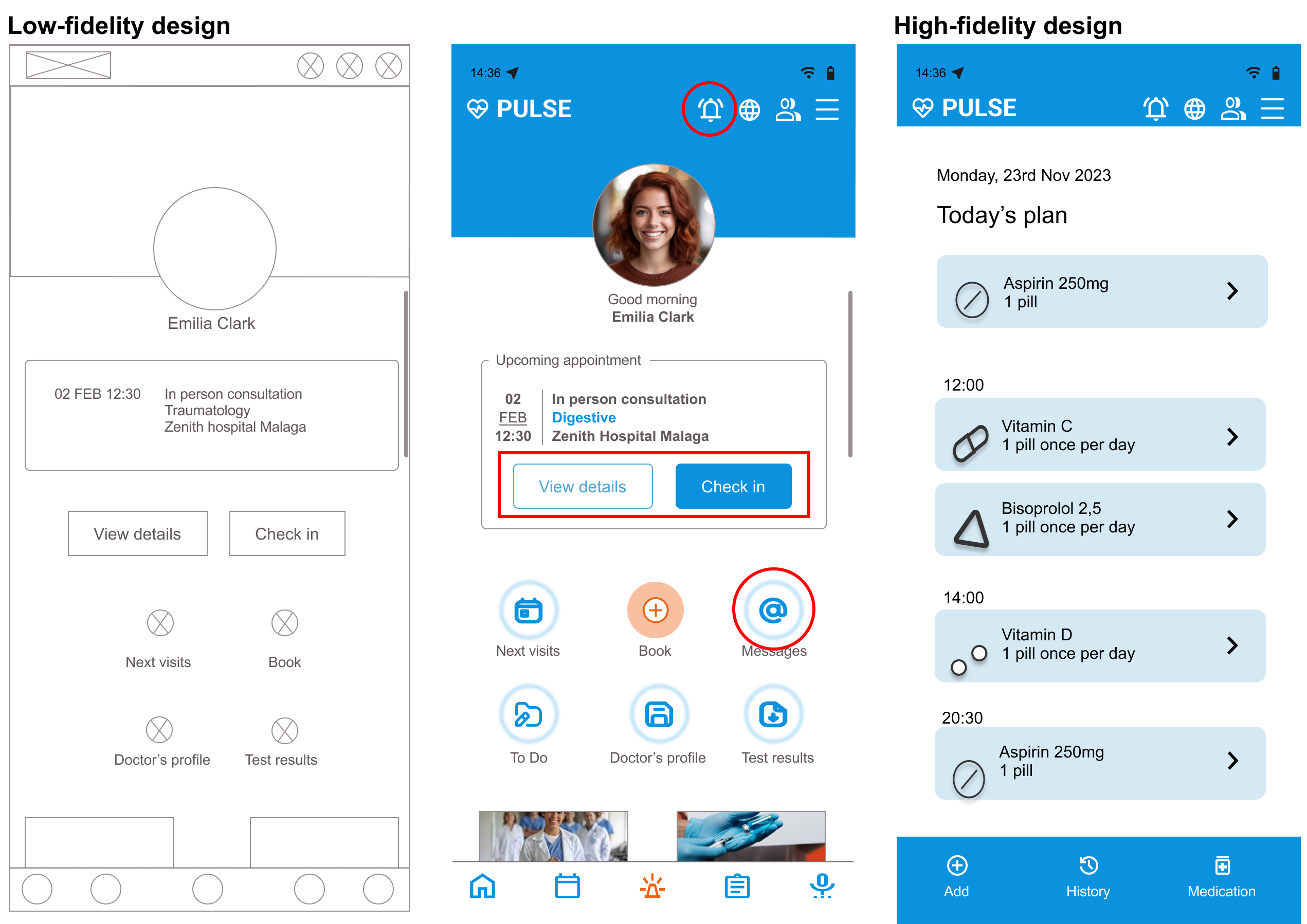
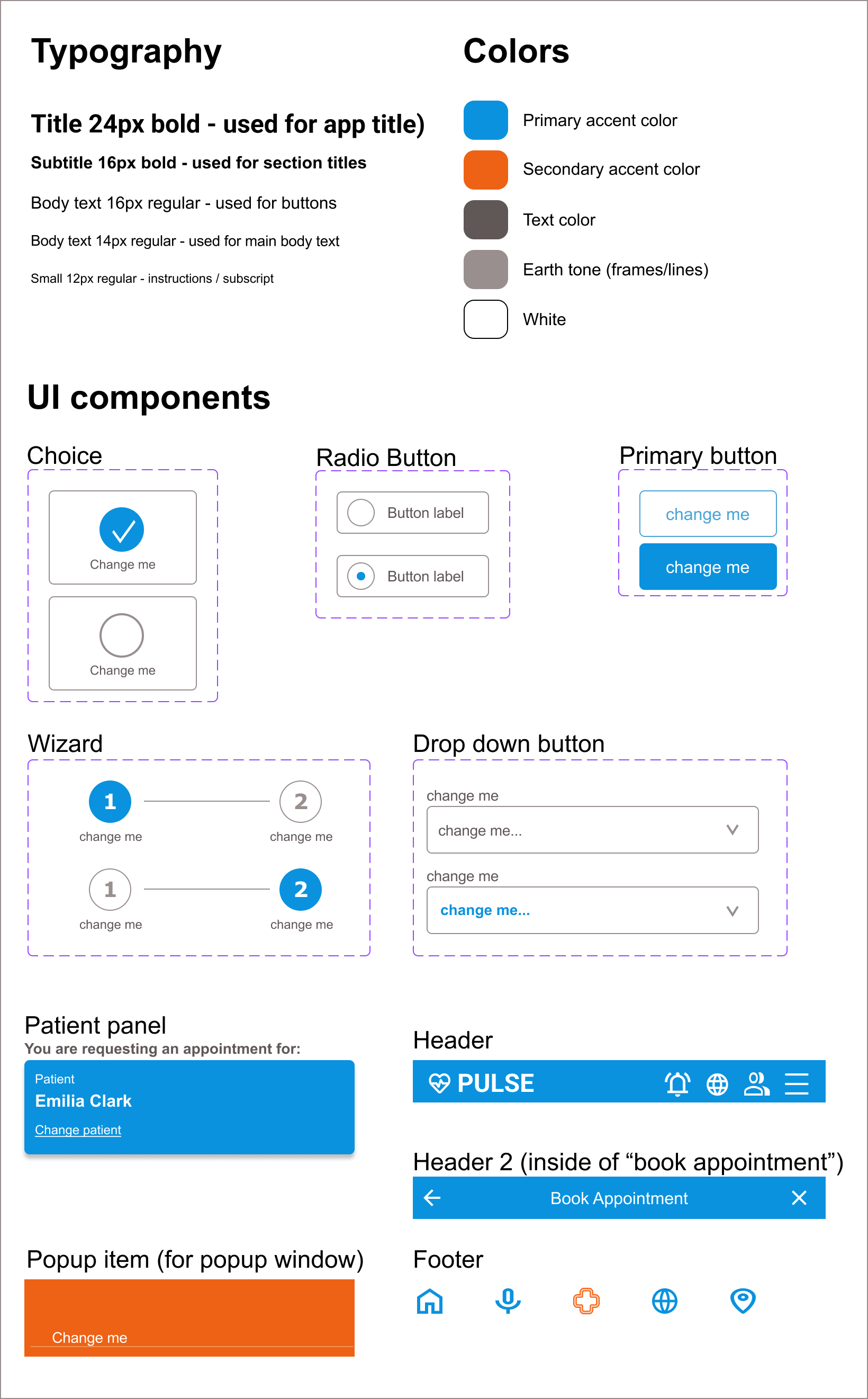
I used Figma to create Digital Wireframes. 
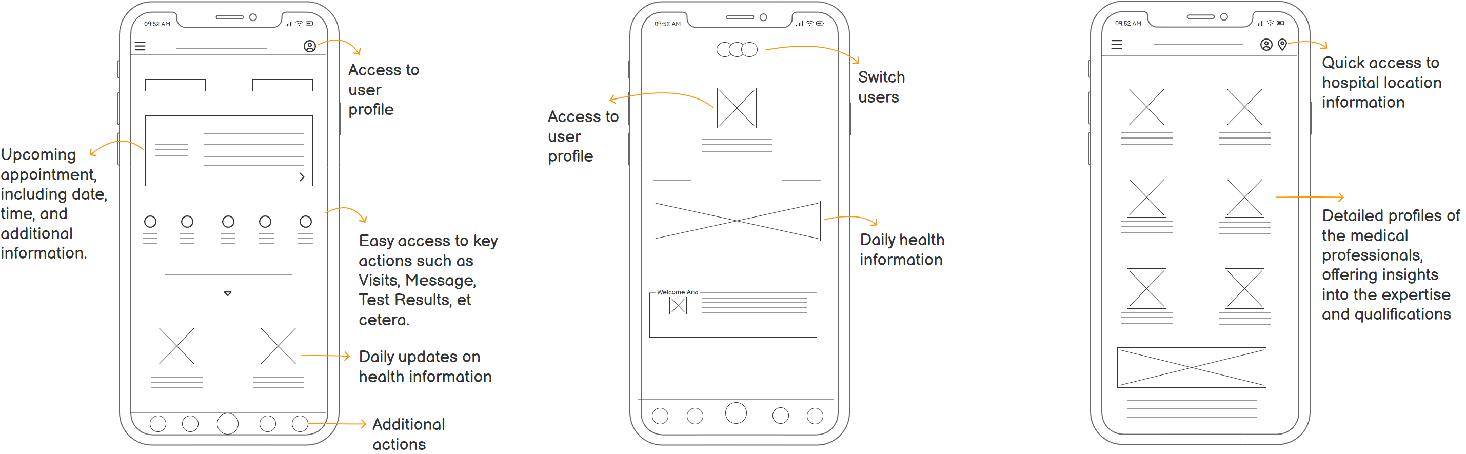
My main considerations for the design were based on the interviews. My main objective was to make it as easy as possible for users to book and manage appointments in any Zenith hospital. 
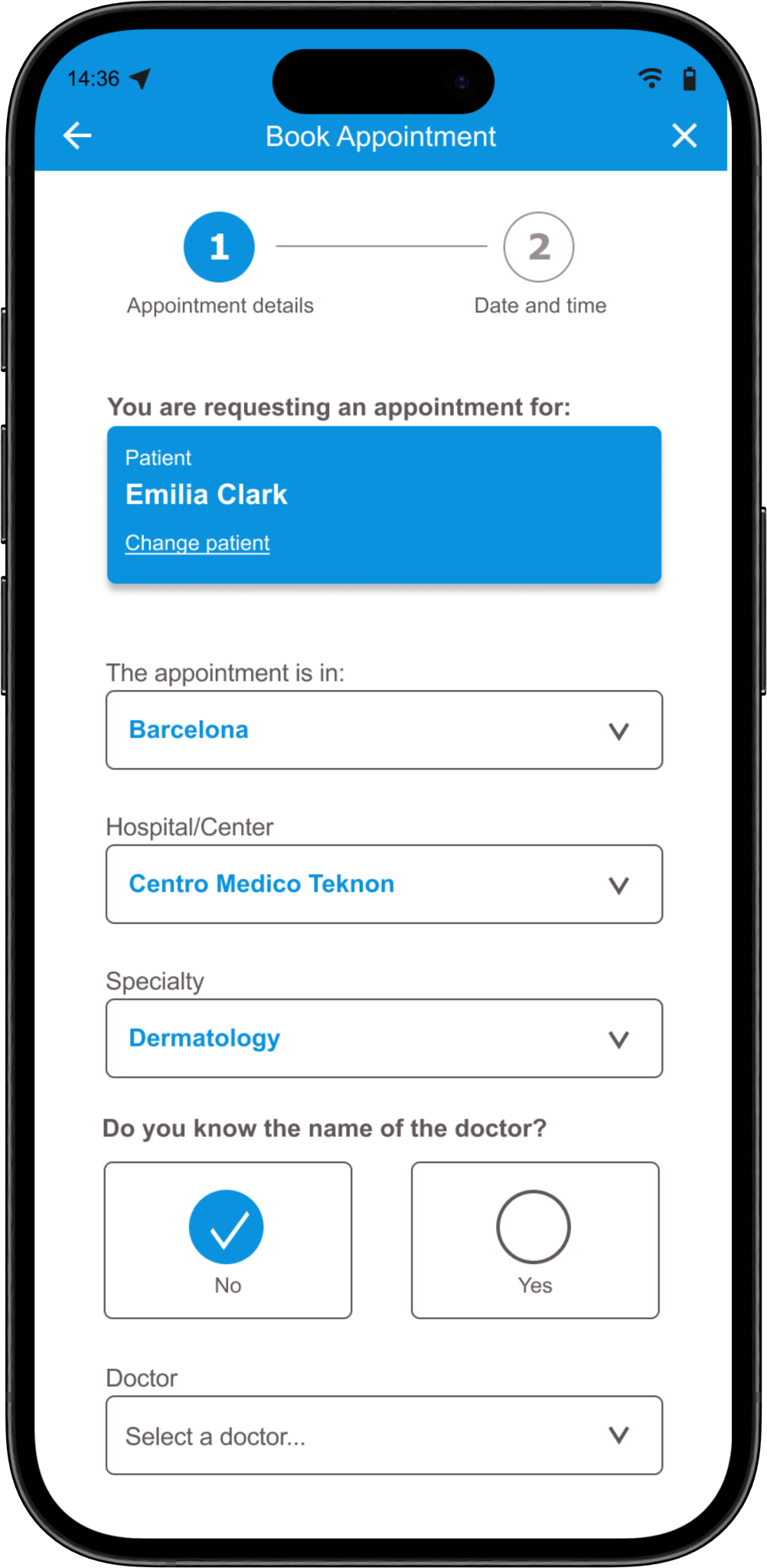
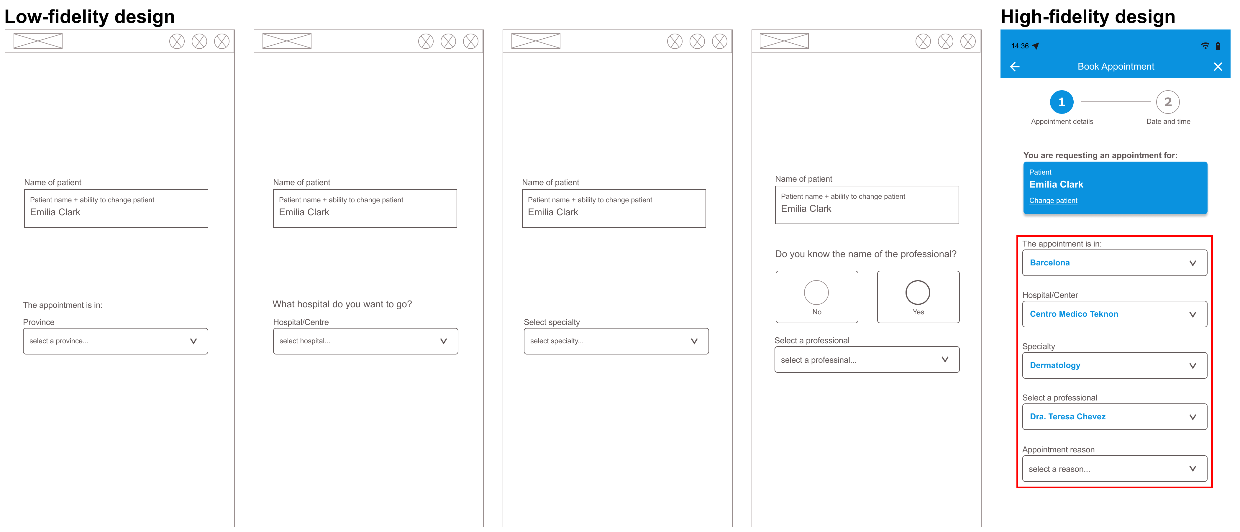
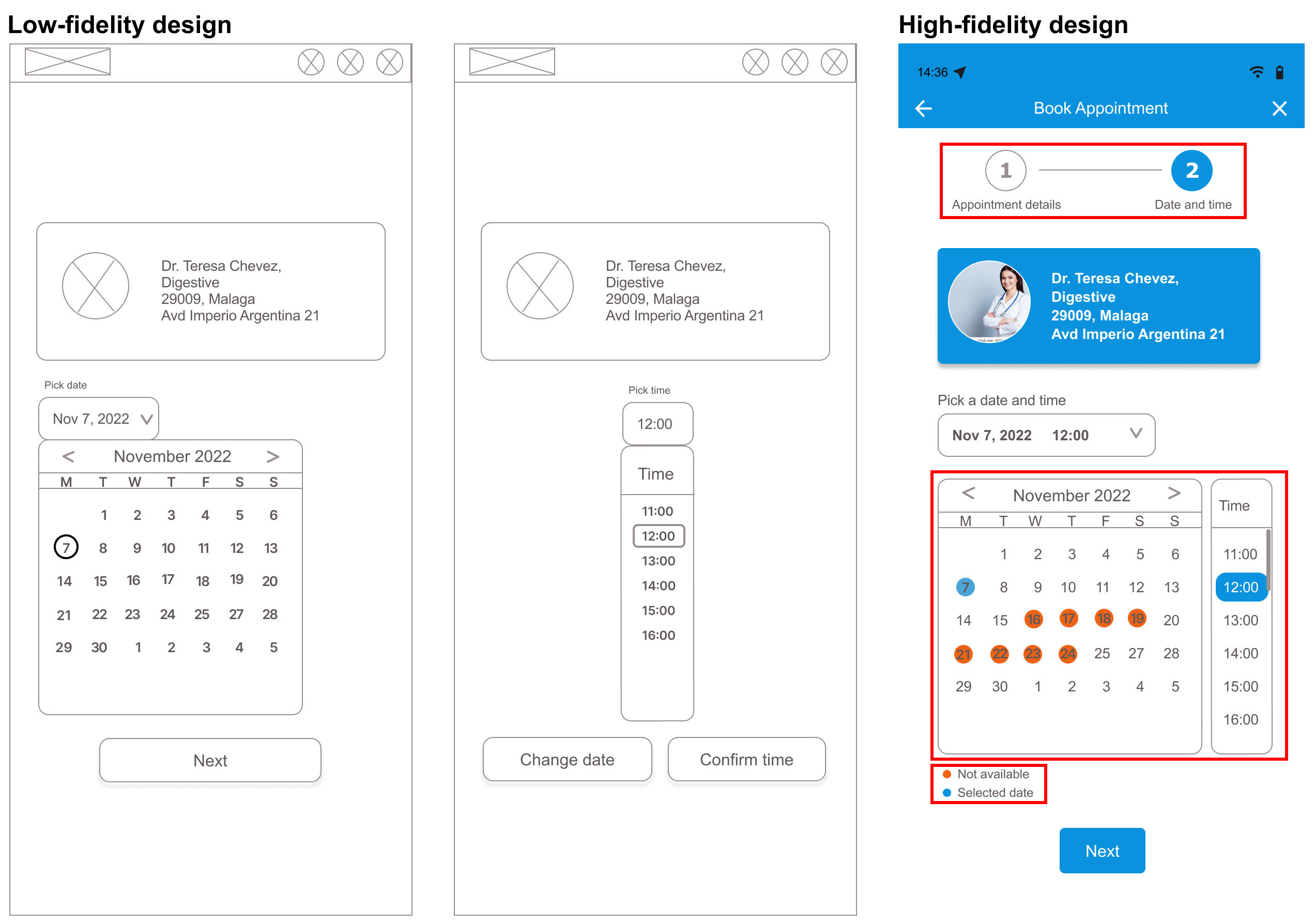
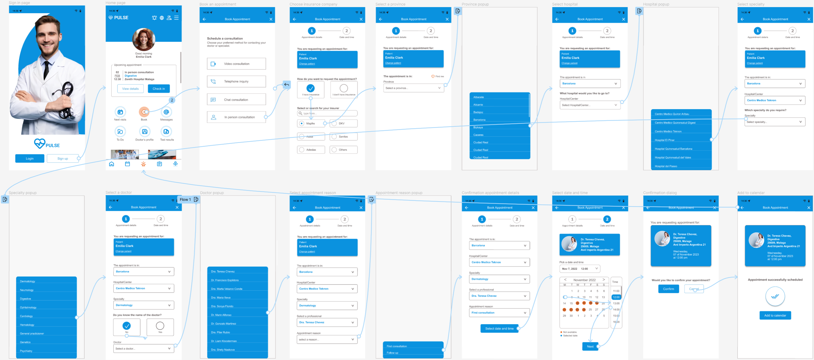
To create a Low-Fidelity prototype, I connected the screens for creating a medical appointment.

Try out the Low-Fi prototype
Usability study
I ran a usability study with 4 participants. These were the main findings that the study uncovered.
1
The booking process has too many unnecessary steps
2
The functionality of the calendar is confusing
3
Users want to have a pill reminder
4
Users would like to send messages to their doctor
REFINING THE DESIGN
Refining the design
  • Mockups
  • High-Fidelity prototype
  • Accessibility
Mockups
I streamlined the design following user feedback during the usability study on complexity of the booking process and calendar functionality. In addition, I added functionality for pill reminders and sending messaging to doctors.
1. When entering appointment details, I combined various separate screens into a single screen that allows the user to easily go back and change previous choices.
2. I combined date and time into a single screen for easier access to available time slots. Added colors and a legend to clarify which slot is currently selected as well as other available slots. Added a wizard at the top to clarify which step in the process we are.
3. I added a medicine reminder and a menu option to let users send messages to their doctor. In addition, to clarify the fact that the "View Details" and "Check-In" buttons are about the first upcoming appointment, I moved them into the appointment panel. Last detail was to give “Book” a prominent color (secondary accent color in the design system).
Design system
A design system has numerous benefits in UX Design, such as improved consistency, speed of design and ease of maintenance. I developed a basic design system for this app in Figma.

Regarding typography: I chose Arial for its modern and familiar look. In addition, it has clean lines and clear distinction between characters, which helps with readibility for all users, especially those with visual impairments.

Regarding colors, I chose simple grey tones, with one primary sky-blue accent color, for its calmness, and its associations with emotions such as cleanliness, trust and professionalism. In only one occasion the design has a secondary accent color (orange), this is to clearly distinguish the most important call-to-action in the app, which is to Book an appointment.

Regarding UI components, I developed several elements such as header, footer and buttons. I created variations of some of these, so that we can easily switch between things such as secondary button, and selected versus non-selected radio buttons. These components are easily reusable and help with consistency throughout the app.

I used the "Material Symbols" plugin to get access to a library of icons with a consistent drawing style.

High-Fidelity prototype
Taking into consideration all user feedback, I created a High-Fidelity prototype. This has a cleaner user flows for making an appointment. It also meets users needs for messaging with the doctor and a pills reminder.

Try out the hi-fi prototype
Accessibility
In general I've been trying to make the design as accessible as possible for individuals with various impairments. In particular, I've taken care with the following aspects:
1
Contrasting colors and large enough fonts for better readability
2
Sufficiently large interactive elements to help users with limited fine motor skills
3
Icons that are self explanatory so they're suitable for users of all digital literacy levels
GOING FORWARD
Going forward
  • Takeaways
  • Impact
Takeaways
Reflecting on my experience with the Pulse app, I've learned a lot. It will shape how I approach UX design going forward. Here are some main points:

The Importance of Listening - Working on this project taught me just how important it is to listen to what users say. At first, it might seem obvious, but really hearing what users need changed my initial ideas a lot. The interviews gave me unexpected insights into what the end users were looking for. Going forward, I plan to include what users say in all phases of each project, to make sure my designs really work for them.

The Value of a Design System - Learning to use a design system was a valuable experience. At the beginning, I didn’t use one and started to see inconsistencies in the design. But then I learned how it helps keep everything consistent and makes maintaining and evolving the design easier. I’m excited to use a design system right from the start in my next projects.

The Silver Lining of Working Alone - The nature of the Google UX Design Professional training is that you basically study and do all projects alone, and the Pulse project was no different. This was at times challenging for me, especially when it came to the technical tasks, such as developing a design system, as this was all new to me. However, what happened is that it forced me to learn these things by myself. Now, I gained some invaluable skills and I can’t wait to work with a team to share what I’ve learned, and keep growing as a designer.

Overall, working on the Pulse app was a great experience!
Impact
In my freshly started journey as a junior UX designer, I belief firmly that digital apps can make difference to the quality of life of people. The design for the Pulse app is a good example of that. Although I created this design as part of a training project, my hope is that some elements of it will be used in real apps, making healthcare more accessible for everyone.